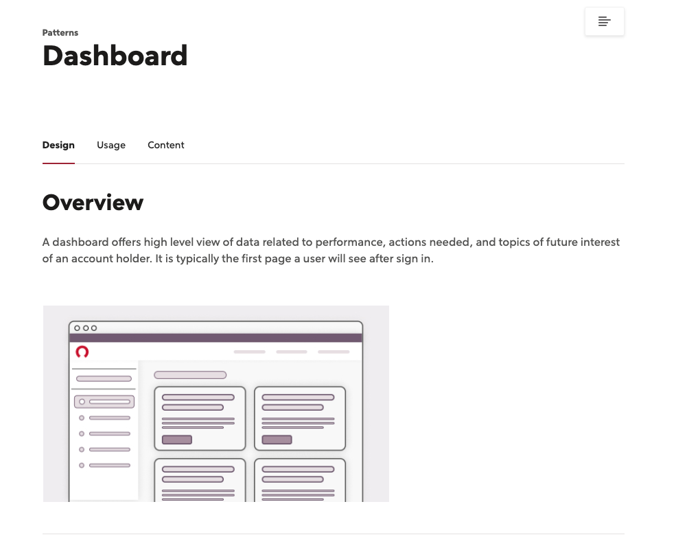
overview
I defined a set of robust design guidelines to ensure consistent design system pattern usage within a digital dashboard product experience.
problem
With multiple design teams contributing to the overall design of the dashboard experience, I identified a need for consistent patterning, utilizing our design system, to ensure a clean and cohesive experience that would elicit trust with our clients.
By streamlining design patterns throughout the dashboard, we will create a clear hierarchy of information that aids clients in decision making and reduces cognitive load.
audience
The dashboard is a one stop hub for a Rocket Companies client’s information. Any given client could land on their dashboard and find information about their mortgage, their financial health, relevant offers and other attachments. With the amount of information available to a client on their dashboard, clear hierarchy, decision making and alerts are incredibly important to ensure the client on the status of their information.
process
1. Reviewed the design system documentation for best practices and a starting point
2. Identified gaps from design system, where unique guidelines were needed for our particular experience
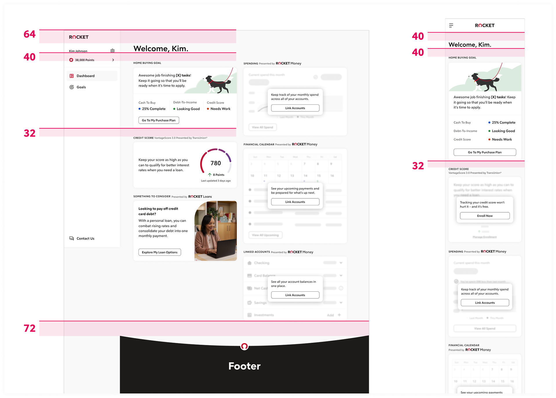
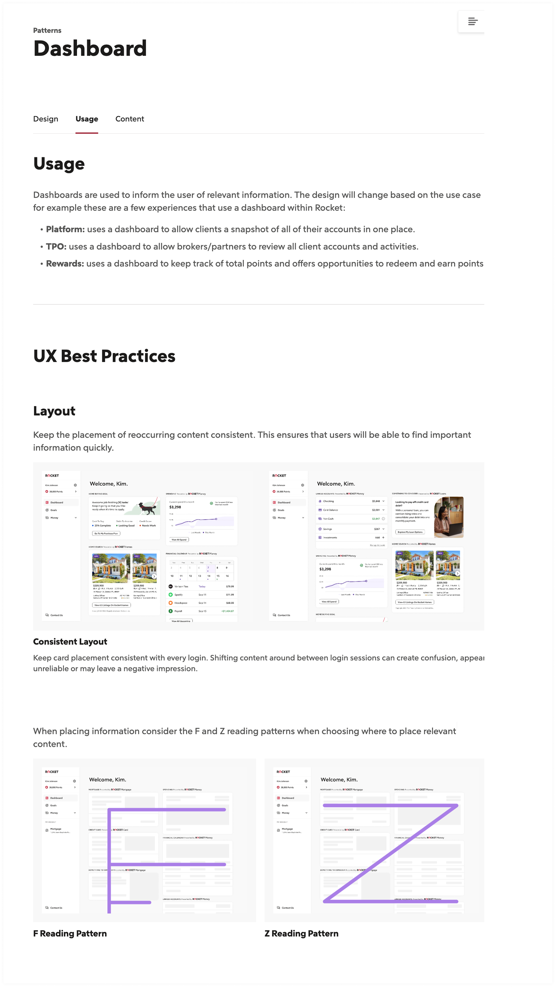
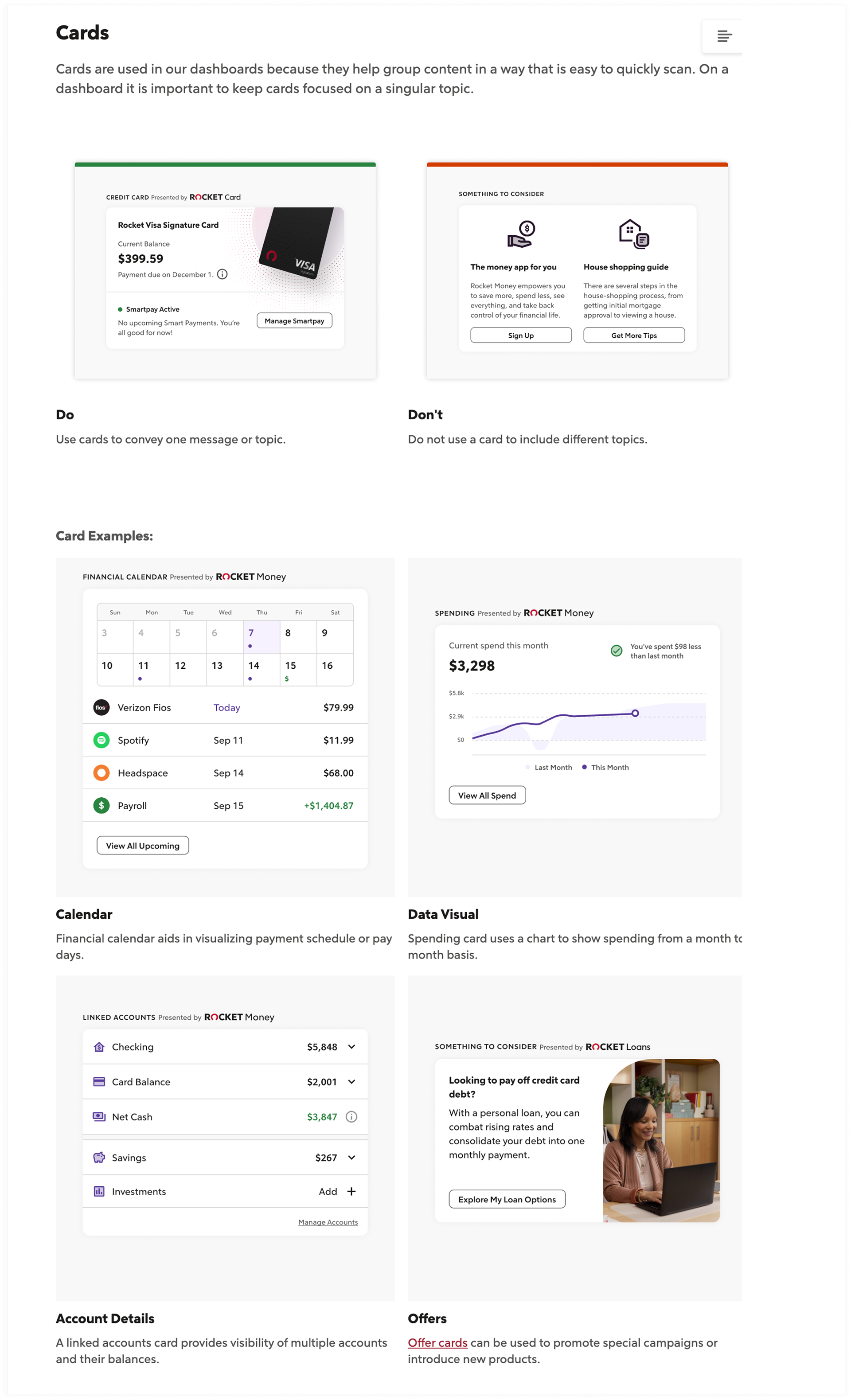
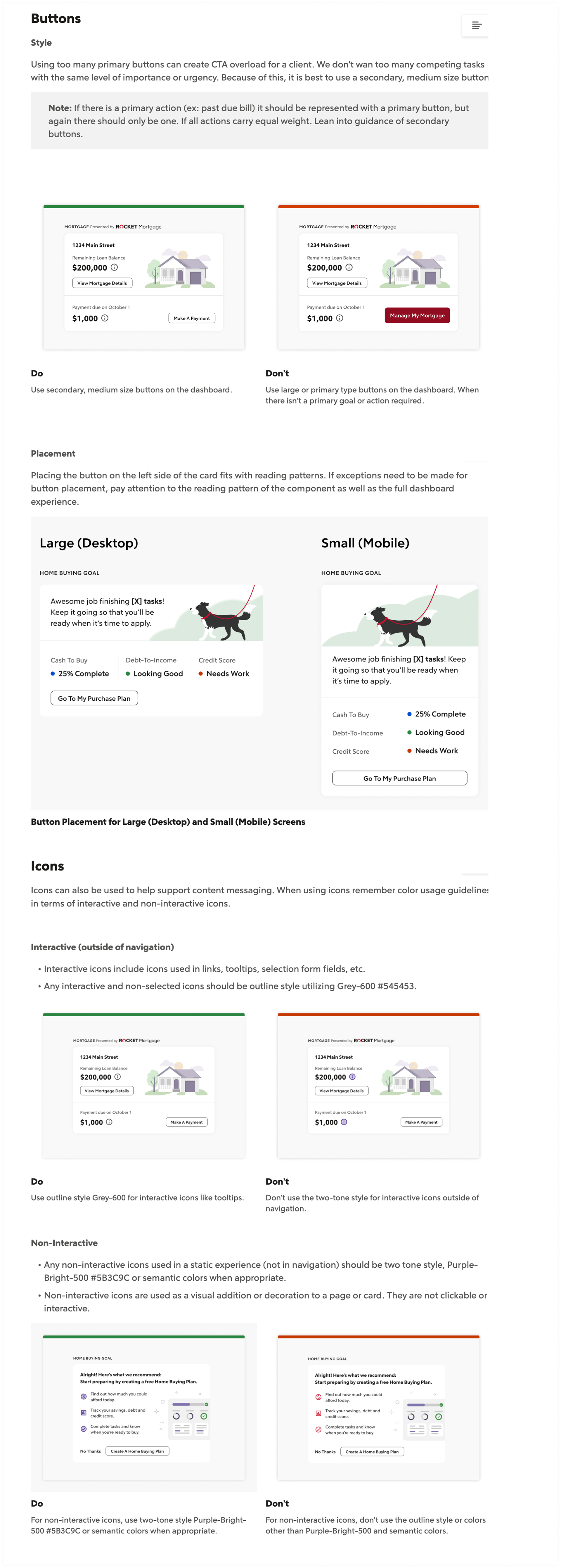
3. Established guidelines for overall page styling, type styles, spacing standards, layout best practices and guidelines for card design, imagery, button placement and more.
4. Audited the current design and found areas to streamline including color, icon and imagery usage, font styling, spacing and more.
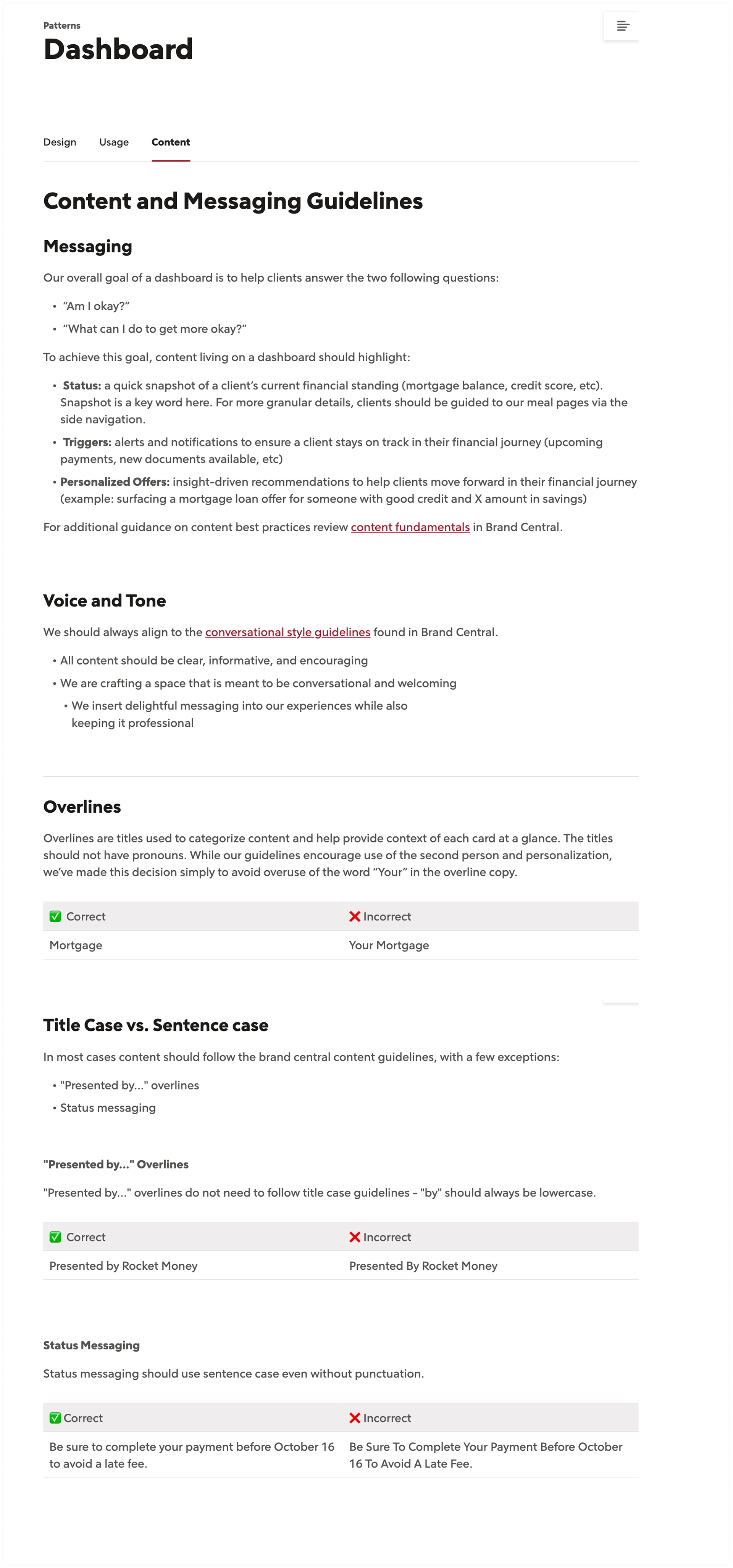
5. Worked with a content designer to establish content guidelines for the product experience including voice and tone, messaging guidelines and grammar and punctuation standards.
5. Published and communicated the documentation of the guidelines for our 100+ design team to create shared visibility into the guidelines.
outcome
Streamlining design patterns led to reduced development time for engineering partners. By having a documented list of design choices, it led to quicker designing time and less decision making for designers.
Anatomy and Spacing Guidance

UX Best Practices - Layout, Card Usage, Buttons, Icons
Content and Messaging Guidelines